


How a SaaS onboarding should look. And why
Here's the one decision that determines whether your onboarding works, and how top SaaS products made it work, even if differently.
How to approach a SaaS onboarding flow. With examples
Add a welcome screen, a checklist, a tooltip or two, ship it, watch the activation number, iterate. That's how most SaaS teams treat onboarding. As a build, aimed one layer too low.
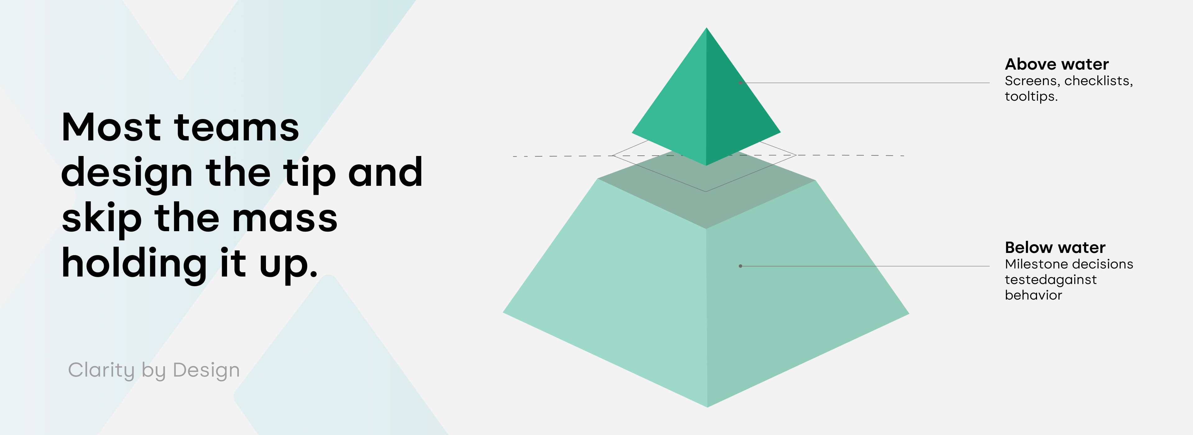
But did you make the decision about what the single action is that proves this product is worth someone's time? Every screen, every checklist item, every line of copy in a flow should be built around that decision. Most churn in SaaS products happens in the first few months, not gradually over a product's lifetime, which is a strong signal that the early experience, not the product's long-term feature set, is where most users make up their minds.
Users leave because nobody defined, precisely, what they needed to experience before they'd believe the product was worth keeping.
Decision vs. Checklist
Ask most product teams what their activation milestone is, and you'll usually get a feature list back, worded as an answer.
A checklist describes a sequence of steps. A milestone is a claim; this specific action is the one that predicts whether a user stays, and claims need evidence behind them, the same way any other business decision does.
Let’s talk in examples.
Loom's milestone is recording a first video. The onboarding sequence is built backward from that single action: users are asked how they plan to use the tool, and by the second screen, they're already choosing whether to record or explore first. There's no meandering tour before it. Someone decided what mattered most before a single screen got designed, and the flow followed from there.
Stripe's milestone is a test payment. The onboarding hands developers pre-filled code and a sandbox environment specifically so they can run a transaction within minutes, without setting up real payment infrastructure first.
Calendly's milestone is a shared scheduling link.
HubSpot's is getting one real deal into the pipeline, framed as a business outcome rather than a feature to explore.
Canva's milestone is a finished design, not a tour of the toolbar. New users are asked what they're designing for, then dropped straight into an editor with a relevant template already loaded, so the first thing they do is create something real rather than study a blank canvas.
Notion takes a quieter route to the same principle: it lets a single user experience value entirely on their own, inside a personal workspace, before anyone else on their team has to get involved. That's a deliberate decision to decouple individual activation from team adoption, because waiting on a colleague to join is exactly the kind of dependency that kills a first session.
In each case, the flow is a downstream artifact of an upstream decision, and that decision was tested against real user behavior rather than assumed in a kickoff meeting. This is the part most teams skip. They design the flow before they've settled the argument about what the flow is supposed to prove.
Personalization is a technique
A lot of onboarding advice stops at the welcome survey: ask a question or two at sign-up, route users into a segment, call it done. Useful, but incomplete on its own.
Typeform asks exactly two questions before a user sees the product: role, and what they want to build. Grammarly does something similar, shaping the very first screen around whatever a user answers. Both techniques work well, but only because each company had already answered a harder question first: which segments genuinely need something different, and which milestone matters for each one.
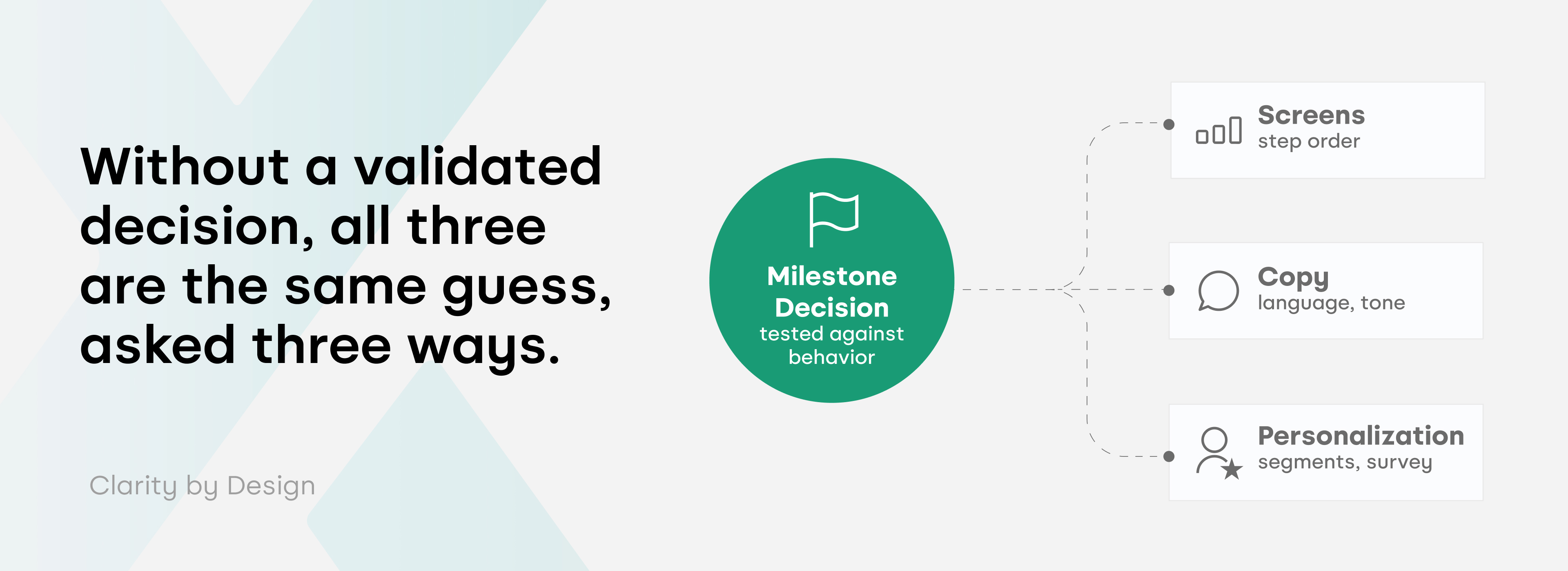
Skip that groundwork and personalization just produces more paths to the same unvalidated destination. Three welcome flows pointed at a milestone nobody tested isn't a stronger strategy than one flow. Instead, it's the same guess, asked three different ways, with a nicer survey attached.
The evidence a real milestone decision needs
Activation rate, time-to-value, and early retention are the metrics that move when onboarding works. For the milestone decision behind those metrics to hold up, it needs a few things in place.
Behavioral evidence of what retained users actually did in their first session, not what the roadmap assumed a "successful" first session would look like. The two are rarely the same thing. The gap between them is usually where onboarding stalls quietly.
Grammarly's writing sample and Stripe's test payment work because each company tested the assumption that their users needed different things, rather than building three variations on a guess.
A named owner for the milestone decision itself, separate from whoever owns the screens. Design can own the flow. The claim about what the flow is supposed to prove needs an owner who's accountable for the business outcome; otherwise it drifts every time someone in a review has a stronger opinion than the data does.
Copyfolio is worth naming here, because its onboarding changed for the right reason. What started as a flow built around advertising to copywriters got rebuilt around a wider range of creative roles once research showed the user base had shifted. The screens changed because the milestone got re-tested against real behavior, not because someone wanted a refresh.
The same principle holds outside classic SaaS, too. When we designed Demetra, a credit application app for farmers with Agricover, the milestone was a completed, accurate credit application from someone who might have never used a banking app before. That meant treating every screen, every form field, and every piece of copy as a test against actual usability
sessions with real farmers, not against what a typical fintech onboarding flow looks like. The milestone came first. The interface followed from validating what that milestone actually required.
What to check before your next onboarding review
A few questions worth bringing into the room, before anyone opens Figma.
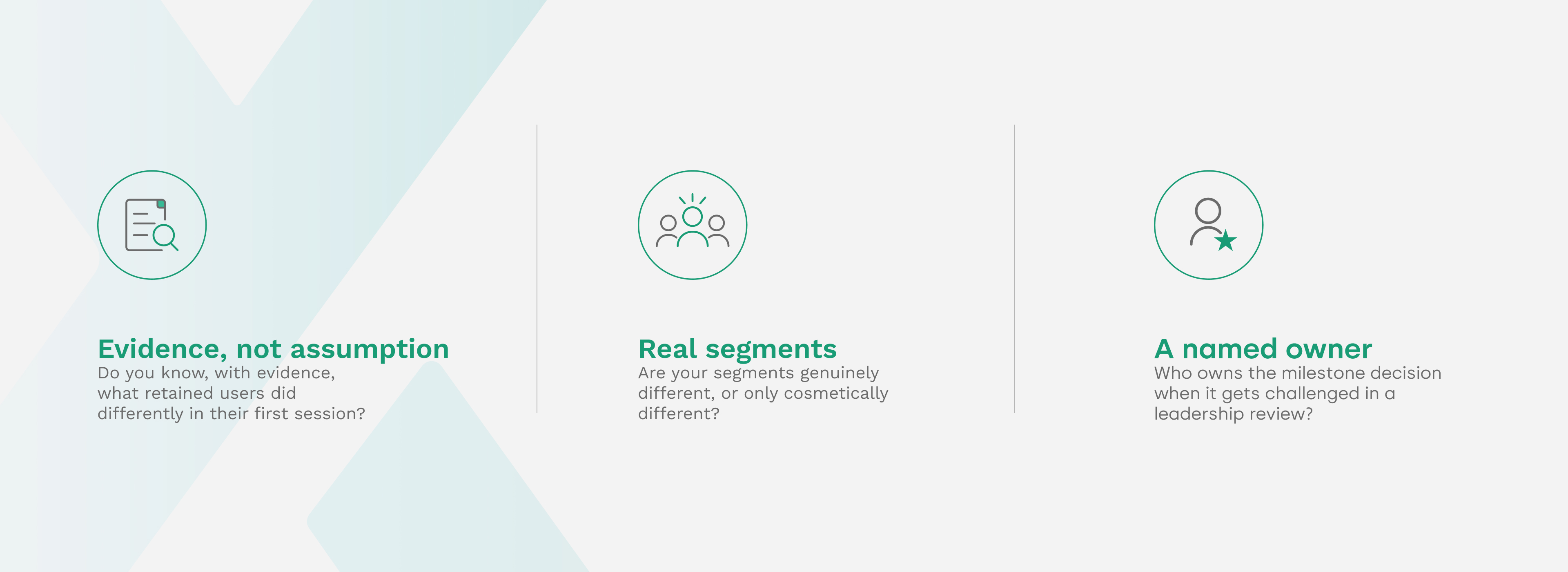
- Do you know, with evidence, what your retained users did differently in their first session? If the honest answer sits closer to "we think so" than "we've tested this," the milestone hasn't actually been set, and everything built on top of it inherits that uncertainty, just with better typography.
- Are your segments genuinely different, or only cosmetically different? A welcome survey that routes three types of users toward the same underlying milestone hasn't personalized anything. It's asked the same question three ways.
- Who owns the milestone decision when it gets challenged in a leadership review? If the honest answer is "whoever happens to be in the room that week," the decision is being renegotiated indefinitely rather than made.
None of this replaces good craft, and the design work still matters enormously. But craft built on top of an unvalidated milestone produces a well-designed version of the wrong outcome. The decision comes first. The flow is simply what that decision looks like once someone has taken the time to design it well.
If your onboarding numbers aren't moving no matter how many screens you redesign, that's usually a sign the milestone was never validated in the first place. Get in touch and let's find the decision your onboarding is actually missing.